GridGap
Overview
I set out to see whether I could design and build a digital product end to end, using AI thoughtfully. As a UX designer, the pressure has increased to adopt AI workflows and I wanted to explore my capabilities. I sought to keep the parts of the craft that matter to me, in my own hands. Beyond technical curiosity, the pursuit was driven by personal interest and an opportunity to address a gap in public data literacy. GridGap emerged, a civic tech web app that maps Oregon’s data center electricity load and connects it to residential rate increases.
I subscribe to a lot of Substacks and startup newsletters. In the Spring of 2026, I felt like every digest or email was centered on data centers. How the market was responding, policy proposals, folks capitalizing on the construction boom associated with data centers, CRMs to manage construction sites, special interest groups to monitor the grid queues, data operations startups, people yelling at each other on Facebook. Whatever it was, it felt like a hot topic rippling through multiple layers of society.
In discovery I stumbled upon a few data points that had a profound effect on me. For example, Oregon residential electric bills rose about 50% since 2020 while household usage stayed flat, and data centers account for a documented majority of load growth. The facts existed in EIA databases, PUC filings, CUB testimony, and reporting, but few had assembled them for a general audience.
Why not put together a visually appealing app that breaks this topic down? The effort took a little less than 4 months to launch from 0 to 1. Within this time I completed research and stakeholder interviews, product strategy and PRD, a nine-table content model, Figma screens for desktop and mobile, the build (Alpine, Mapbox GL, Netlify, Airtable), sourcing and citation discipline, and real-device QA.
At a glance: the subject
The numbers the product had to get right, and the reason source discipline became the core of the work.
50%
Rise in Oregon residential electric bills since 2020, while household usage stayed flat
64000
Oregon households disconnected for nonpayment in 2024, a record
1289
Estimated megawatts at the largest mapped campus. The figure that moved most as data vintages changed during the build.
796
Homes per megawatt, the NW Power and Conservation Council conversion every comparison on the site depends on
Foundational Decisions
Megawatts, Not Facility Count
Oregon has somewhere between 84 and 136 ‘data centers’ depending on who is counting and how. The range is easily disputed. Megawatts of grid draw are unambiguous, tied directly to ratepayer impact, and visually powerful, unlike a building count.
Steer from Electric Bill to the Utility
The product is meant to serve any Oregon residential customer. Utility-specific content lives inside the experience and surfaces only after the person self-identifies. The entry flow is designed not to assume which company sends the bill.
Claim Only What the Data Supports
One tap, “Who sends your bill?”, personalizes the experience without feeling like a form. The dollar estimate shows one card, chosen by the user. The data quality between PGE and Pacific Power is asymmetric, and the app is honest about that rather than hiding it behind a side-by-side.
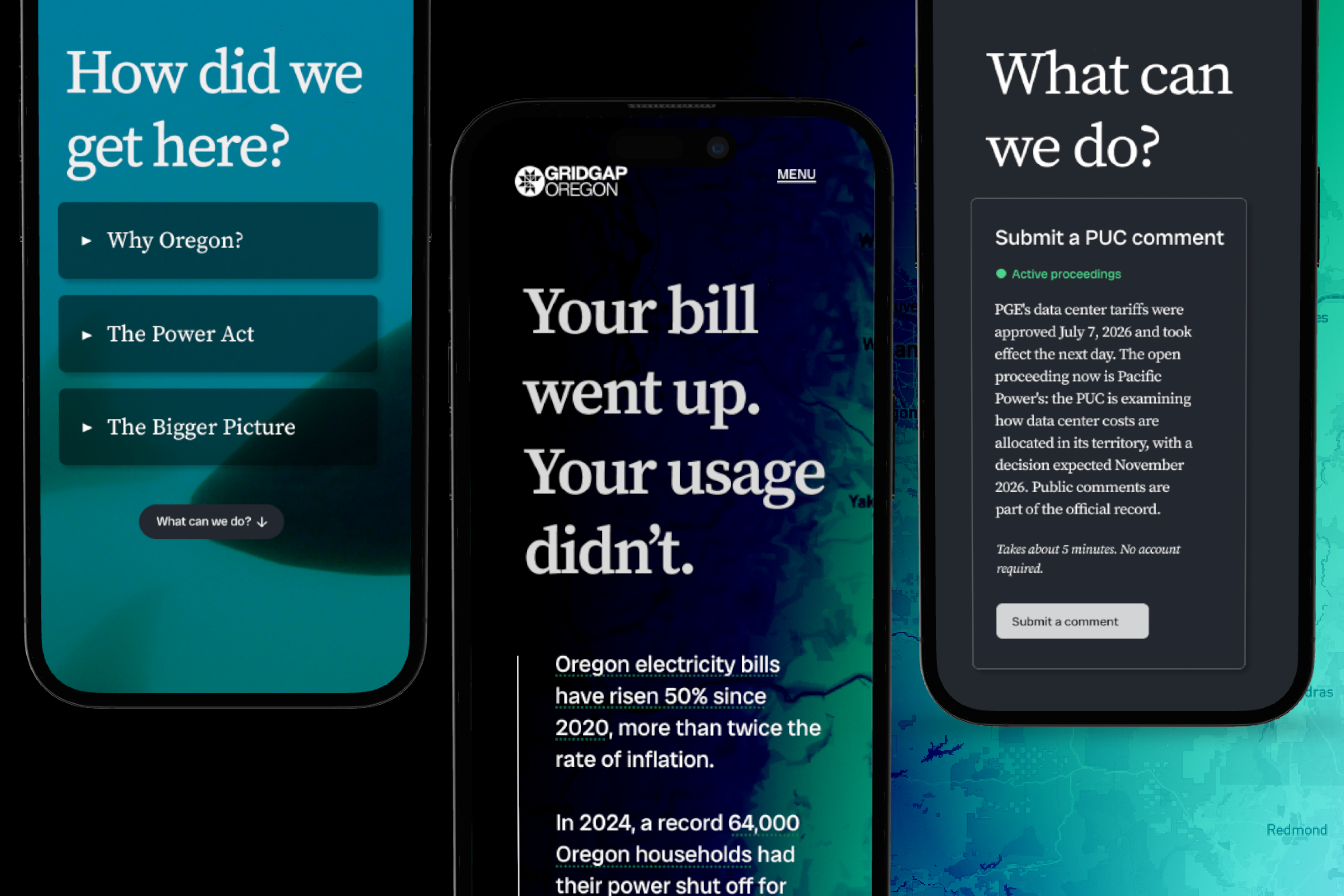
The splash headline, “Your bill went up. Your usage didn’t.”, is a factual statement sourceable to EIA residential consumption data and uncontested rate case filings. No villain named, no causal claim, no implied intent. That restraint is the trust architecture. It is what could make the Citizens’ Utility Board comfortable citing the app in a rate case, which is one of the two success metrics I set for year one.
At a glance: the build
What it took, in the units that matter for a design-ops story.
4
Months from discovery to launch
9
Airtable tables housing the content architecture
0
npm dependencies. Static files, CDN scripts, Netlify.
1
Person. Design, content, data, build, QA.
Process
Discovery to Delivery
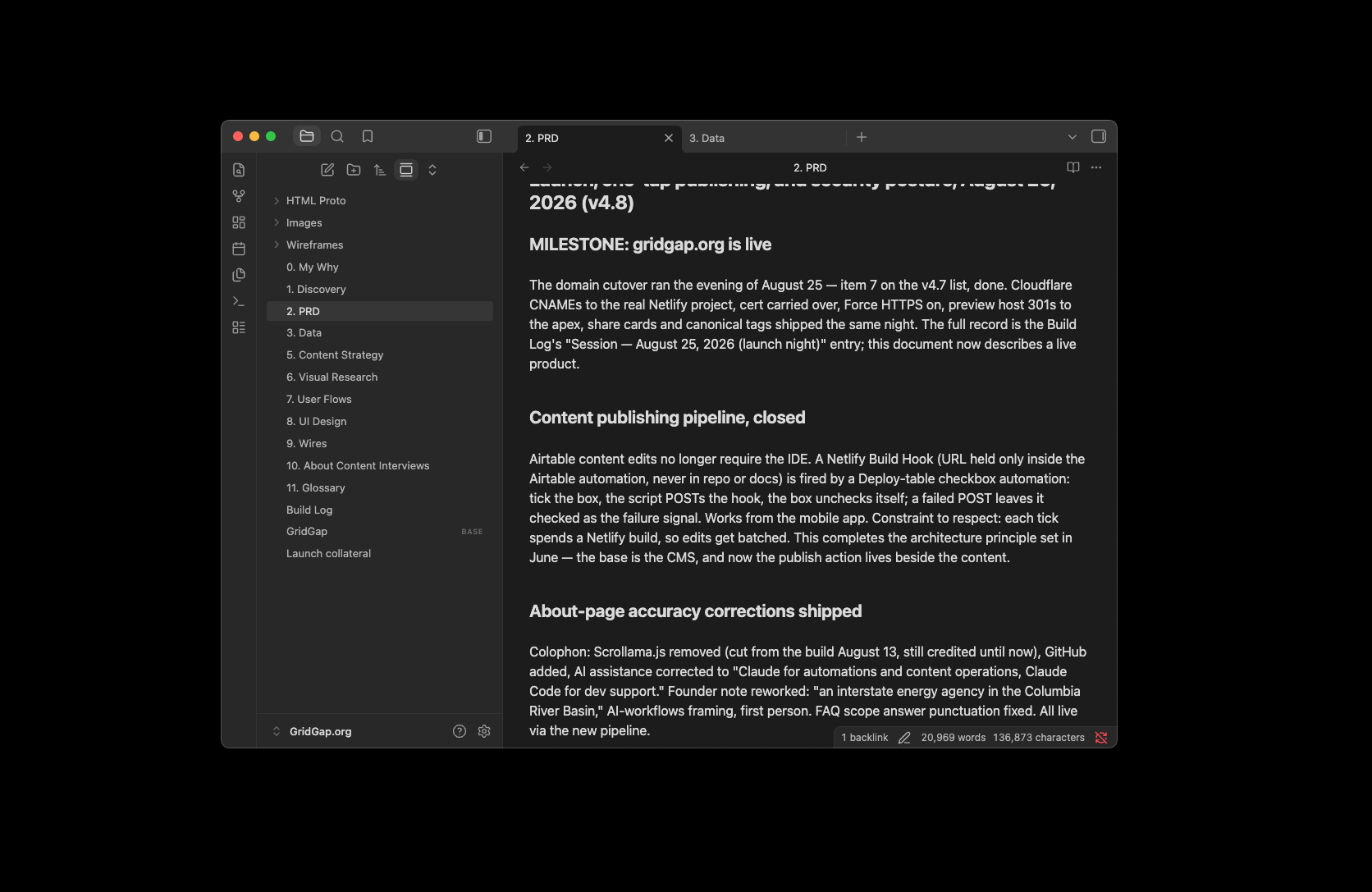
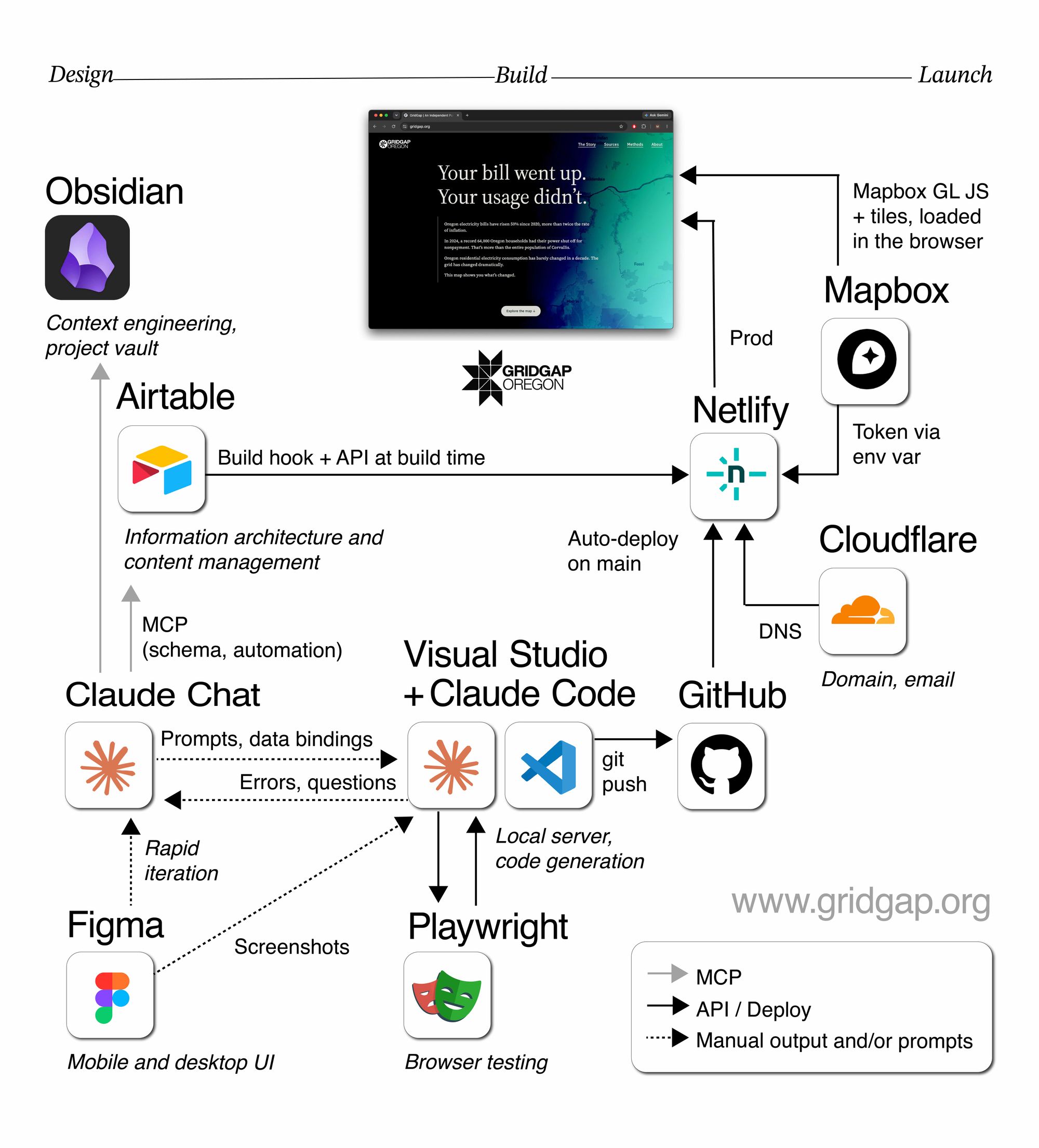
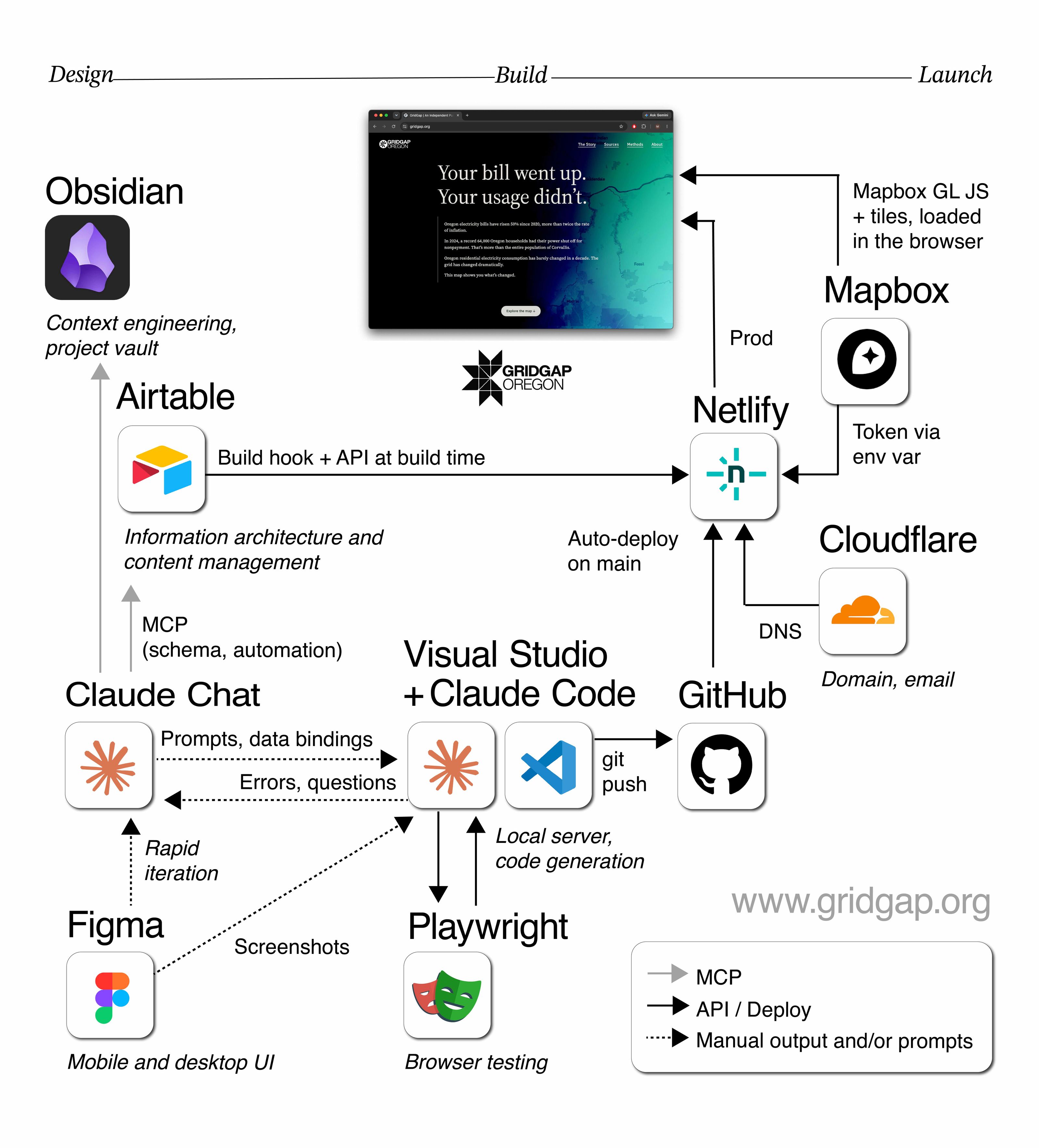
To begin, I asked Claude to interview me for the PRD (product requirements doc) after conducting a market analysis. I wanted to see what underserved personas exist; or what opportunity for novelty arises in this niche civic tech space. I set up a Claude to Obsidian MCP. I treated the Obsidian vault as the brain of this project. This became important because so much text was generated in this endeavor that I wanted to create a library for these stray .md files that get created. I wanted a system to stay organized. I leaned into my agency and consultant experience to create an end to end delivery process from discovery to post flight. This spine created the architecture for the vault. I got into the habit of telling Claude to add to PRD and a separate session log after every significant chat, about 20-30 turns. Every time I resumed the work I asked Claude to review the most recent PRD entry and session log for context management.
Motivate the User
I had an idea of what I wanted the screens to look like in my head, and I wanted to anchor them in a narrative. I was inspired by the visual storytelling of the New York Times and The Pudding. I needed some defensible info to drive the point home and inspire the user to take action. If I can persuade someone to read up on local decisions, find out who represents them or show them how to make public comments, the conversion was successful. I’m not asking folks to put the sweater in the shopping cart or book the appointment or buy the ticket, I’m asking them to care enough to get involved. Hence, the importance of the call to action after making the case on the home screen. The supplementary pages describe sources and methods at great length to bolster the credibility of the story being told.
Sources Are a Moving Target
I quickly realized that source management was intense, and a moving target. There were items pulled off of federal data sites within weeks of tracking and indexing. The internet is an organism that is not static, and deeply reflective of the current (and dynamic) state of affairs.
One of the drawbacks of creating a web app that relies on content from other agencies is that content can go stale while you’re building the house, or literally anytime after launch. To combat this, and to alleviate the tedium of content management; Claude MCP wrote a weekly cron job via an Airtable automation action to email me content reminders on a weekly basis. However, that only addressed the source staleness problem. There were structural concerns as well.
Generators, Not Loads
I didn’t know what I was really working with until I had articulated what each map component would actually show. I grabbed a screenshot of a default Mapbox view, and placed it in Figma. And confronted myself with how to show UI elements and their relationship with the data available to me.
For example, the PRD originally defined that EIA-860 would be the primary source for megawatts. In the first build session I confirmed that EIA-860 tracks generators, not loads. It could not produce the numbers the map needed. I pivoted to Baxtel facility estimates cross-referenced with EIA-861 utility sales and NW Council load forecasts, and every figure on the site now carries “estimated” or “approximately” as a matter of discipline. The About page copy that still said “EIA federal databases” got flagged in my own PRD as a sourcing mismatch a skeptical reader could catch, and fixed before launch.
Content Model Before Pixels
To be honest, I take my free time seriously. I thought deeply about how to maintain a web app with the least amount of overhead possible. That preference led me to utilize Airtable as much as I could, in case I’d ever want to delegate content management to a non-technical volunteer or agency. Also, I personally didn't want to go through git for every content tweak. This meant that setting up a content architecture and schema in Airtable was worth the time upfront. Instead of hardcoded content, nine Airtable tables hold almost every word on the site: operators, utility cards, context sections, action cards, sources, methods, FAQ, site metadata. Most of the copy is separated from the code. A build script fetches all nine at deploy time and writes one content.json; editing a caption in Airtable and pushing is the entire publishing workflow.
Design in Figma
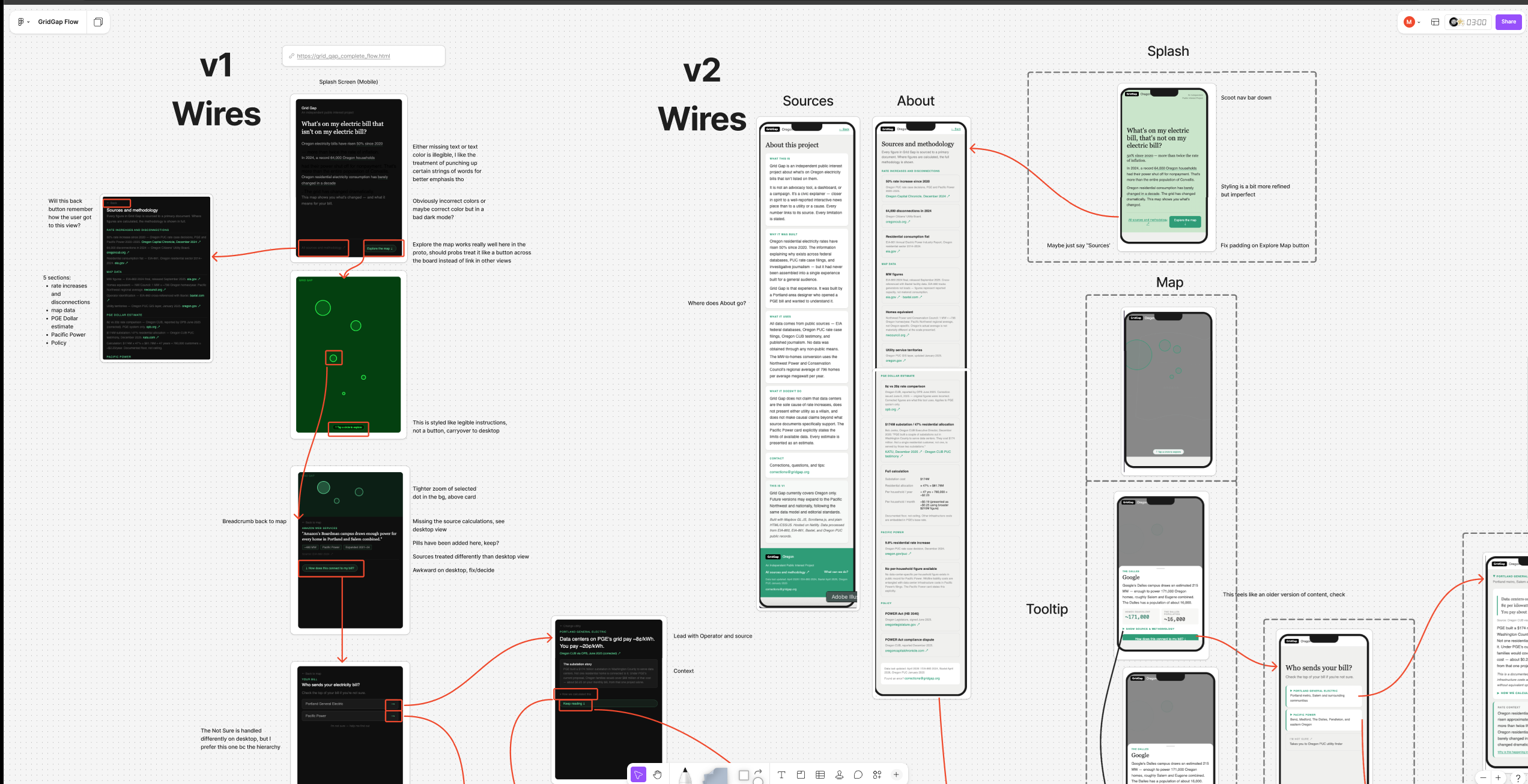
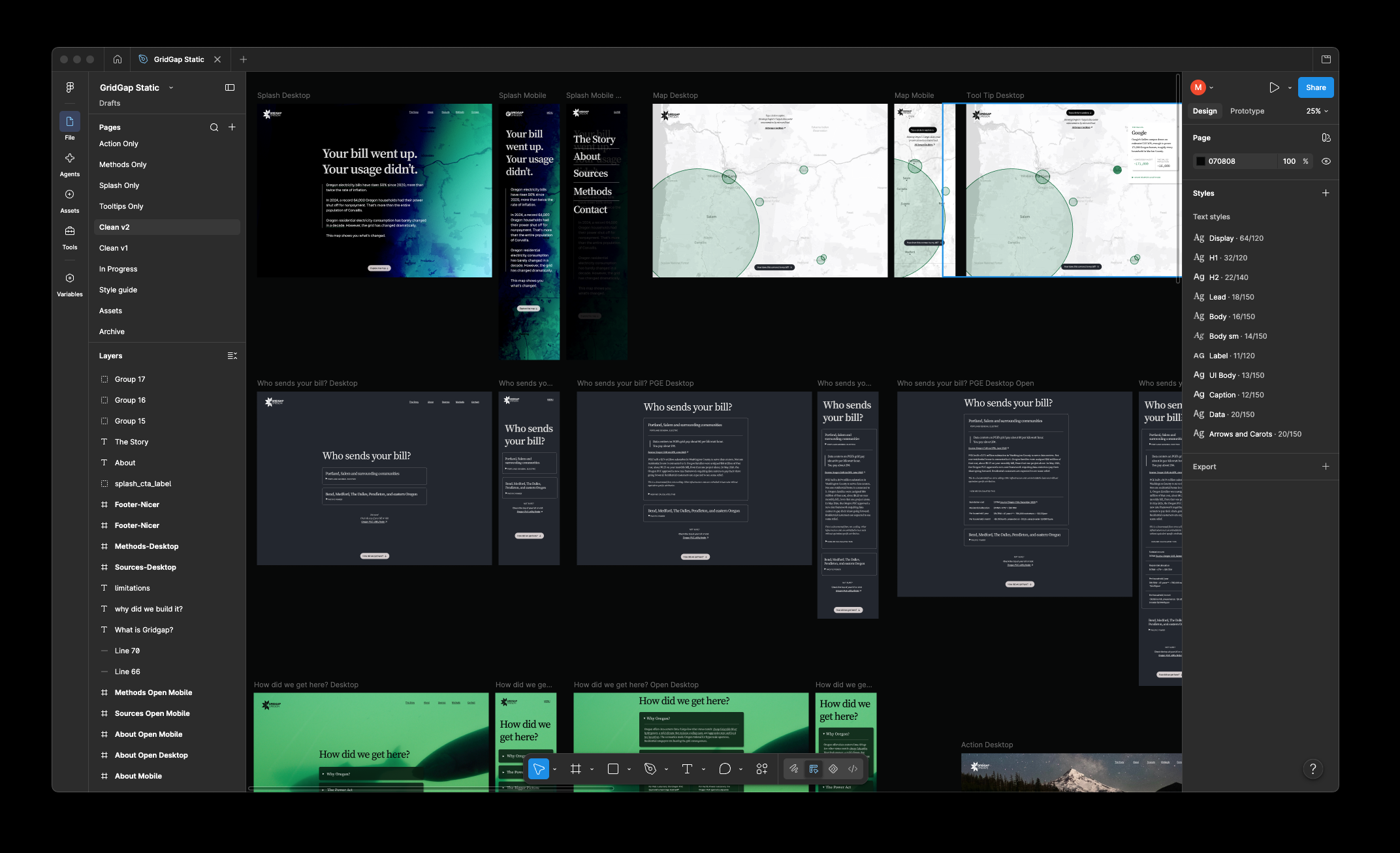
Splash, map, tooltip closed and open, the utility section in every state, the context accordions, the action cards, the three content pages, all of it again at mobile. The map is tap-driven, not scrollytelling; circle area is proportional to estimated megawatts, so twice the load is twice the ink, and tap targets are sized independently to meet WCAG 2.2 so no circle was ever inflated to make it easier to hit. I wrote the site’s interaction rules before the build: a pill means one thing, an underline means another, and tried to carry that through, barely resisting the urge to create a full-blown design system for this demo.
Five Revisions for the Tooltips
All this streamlining and automation left me just enough time to go down the rabbit hole on my special interests. For example, the first live tooltips were a mess. I mocked all five operators in Figma, standardized the seven rows, the citation format, the household comparisons, and found that the first stat label was hardcoded rather than data-bound, wrong in four of five mocks. It became “Household equivalent” site-wide because that is the word in the NW Council’s own sentence. After 5+ revisions normalizing the amount of data for each operator and optimizing for multiple viewports, we landed. However, this was a content issue, not necessarily a build issue, I just needed to see it on screen to see how many adjustments needed to be made.
Build with Claude Code, Supervised
Beyond the content drifts and challenges, the build itself was pretty straight forward. The build is static: Alpine and Mapbox GL from a CDN, no bundler, zero npm dependencies, deployed on Netlify. I handed Claude Code scoped, literal instructions and read every diff. When a one-line href change came back with extra attributes that I didn’t ask for, I stopped it mid-run and rewrote the instruction. When the Mapbox map failed to render, the cause turned out to be a token setting in a web console, not code. Delegating on purpose included knowing which layer the problem lives in. In other words, I got through this experiment by staying really organized.
Test on real devices, not simulators
Section heights, the tooltip’s scroll affordance, the map pill placement: all found on an iPhone, not a simulator. Three measurement traps in one session, each producing a plausible wrong number, taught me to distrust round results and re-measure before believing a fix.
Kept / handed off
I decided which parts I want to do myself, and delegated the rest with purpose.
Figma
The screens that mattered, mine.
Prose
Rewritten by hand once the content architecture was set.
Microcopy
Delegated. Labels, captions, alt text, error states.
Build
Delegated to Claude Code, supervised line by line. Stopped it mid-run more than once.
Outcome
The site launched on schedule with every figure traceable to a dated public source, a content pipeline that lets me publish from Airtable without touching code, and a review automation that flags content before it goes stale.
The build itself was straightforward. The hard part was judgment: which data vintage to trust, which claim a source actually supports, which task an AI could own and which it could only assist. Most of the four months went there, not into code.
What I brought that no tool could: the content model, the interaction rules, the decision to re-check a number that looked fine, and the discipline to stop a build mid-run when it overreached. That is design strategy, and it is the work I want to keep doing.