Contents
We may think of search as this thing we pose a question to — and then, via a mystical process —answers materialize, like a digital Magic 8 Ball. The reality is that search is complex. UX designers with an understanding of information architecture and user behavior can be important voices in search strategy. In the following, I’ll touch briefly on best practices and share my experience designing search UI for business intelligence dashboards and engineering applications.
Search Strategy
Before you start prototyping, it’s good to ask a few questions about feasibility and business goals. Search is one of those things that has hidden overhead so it’s helpful to learn about constraints before demoing something that can’t be executed technically. Also, sometimes business customers may not have a detailed idea of how the proposed search should function. In that case, the strategic work may become a burden on the dev team, or, alternatively, a piece of non-functional UI will roam free in the wild.
When it comes to search strategy, Nadya Tsech suggests considering user needs: understanding when they use search, how they form queries, and what they expect to find. Peter Morville and Jeffery Callender also suggest isolating the who, what, when and where of search behavior. In other words, align your strategy with context. For example, Jeremiah Lam shares a couple of interesting observations about AirBnB’s search experience. AirBnB’s search doesn’t have strict naming conventions because content is user-generated (lots of variance in vocabulary) so there’s more emphasis on relevance than precise keyword matching. The UI also allows the user to filter specific attributes like price, location and date available.
A similar approach is dynamic search. Dynamic search works well when there is a lot of results and you don’t want to burden the user with specificity. Netflix’s search functionality is an example of dynamic search. There are a finite number of shows and movies to select and Netflix has complete control of metadata and architecture (prerequisites for an effective dynamic search). Amazon is hybrid of user-generated content (seller listings) and a fair amount of enterprise control. Amazon utilizes pre-filtered categories (Prime Video, Amazon Music, etc.) which is a flavor of faceted search.
In old school search terms, federated search is when the query returns info from all databases and repos associated with a product at once. Faceted search is breaking up the pile of the searchable stuff into predefined categories. Federated search can be more thorough but may result in slower performance or less relevant results. Faceted search can make for a more efficient experience, however, the strategists involved need to ensure that the categories reflect reality and make sense to end-users. Insularity may result in category errors. (Faceted strategies provide an opportunity for UX to validate taxonomies via card sorting exercises or other methods.)
UI Best Practices
When you agree on the high-level strategy: faceted, federated, dynamic, filtered, etc., you can start to think about how the user will interact with search either through UI, voice or gesture. There are quite a few best practice lists floating around, but I like how Dawson Beggs offers succinct advice on things a lot of designers take for granted. For example, use a magnifying glass icon for search. This may seem like a no-brainer, but dev teams often work at breakneck pace during Sprints and may implement canned front-end templates without pattern libraries or usage guidelines. (You might see the ‘Send’ paper airplane used interchangeably instead, these things definitely happen.) Be explicit about search patterns and make everyone’s life easier.
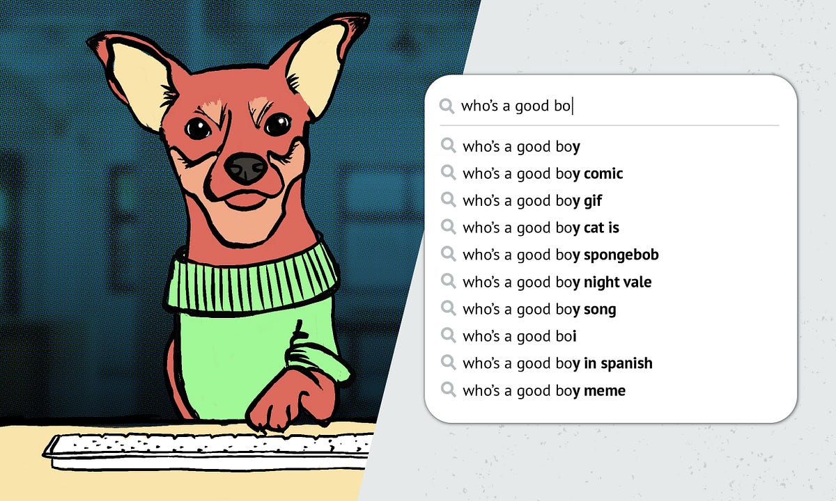
Other tips include making the search easy to find, styling the input fields as obvious input fields, using help text to set input expectations, and providing a submit button (unless your search is dynamic). If you design an auto-complete dropdown, consider visually distinguishing different types of search results (image file vs. webpage, etc.). For the results, regardless if they are an SERP in a browser or an answer from a voice assistant, do what you need to do to ensure that the functionality is aligned with expectations of the end-user. Check in, make note, and iterate.
Search in BI and Engineering Apps
In general, the said best practices work well for most search experiences. However, there are special considerations for search on data-dense products such as business intelligence dashboards and engineering applications. Many of these tools are enterprise facing and based on industry specific parameters. Users may input queries in Boolean stings or natural language questions. Lookups based on keywords, values, and thresholds related to manufacturing process include:
- product serial numbers
- dates specific to production: offline, online, months-in-service
- repair codes
- diagnostic status: pass, fail, first pass yield
- manufacturing locations
- associated business units
- IDs for specific processes, tools, or robots
- vendors and suppliers
- key phrases in warranty claims
If you’re designing a stand-alone app you have a lot of freedom to design a search UI to set up users for success. In my experience stand-alone apps that do well tend to have UI that follow these guidelines:
- Keep the keyword or search variable persistent to reduce cognitive load. (Remind user what they searched for, and keep it on screen until the user searches something else.) Capturing frequent searches or last searched items and making them visible/accessible to a user is a nice affordance as well.
- Map terms to a controlled vocabulary. For example the value “ZZ123456” can be paired with a parameter name of serial number, truck, vehicle, product, or unit. What you call things in the UI can be adjusted for usability.
- Effective pagination is really important because displaying legible data tables with limited screen real estate is a real challenge.
If you’re not designing a stand-alone app, you’re probably using a platform such as Power BI, Alteryx, Cognos, Tableau, Azure Devops, etc. Search functionality constraints may vary but product teams can still ensure proper implementation by consulting with UX and architecture experts. These platforms are also really powerful and you can use them in conjunction with different data annotation methods to visualize machine learning insights.
Emerging tech also opens the door for different ways to search. For example, instead of relying on image metadata, computational models can learn, over time, to identify pixel content via neural network image processing. However, a lot of this tech is beyond the grasp of teams that lack the resources to house and maintain the volume of data required. In the meantime, UX designers can add value by working alongside architects and analysts to craft robust search experiences that align technical feasibility and user needs.
The Bottom Line
It’s really important that your search actually works because it can make or break user perception of your product.
Search can create frustration within a few clicks or it can lead to enriching exploration. With search we have mountains of data at our fingertips, but what I find most interesting about search, is that it’s really about people. It’s an inherently social feature. Our search queries tell a lot about us, they are windows of intent. Because of this intimacy, we also have an ethical duty to take privacy into consideration. That concern for ethics also extends in the way we design our algorithms and data blends — because when we provide results to a query, we are in a way, curating reality. That’s a huge responsibility that product teams should take seriously, and something that we should demand as users.