Contents
When designing for technical users, understanding pain points may be difficult if you don’t have a deep understanding of a product’s purpose. As long as you have a grasp on context, you don’t have to be a subject matter expert on anything other than design when making tools for analysts, data scientists or developers. Here are a few tips on how to design for technical end-users:
Map the Process Together
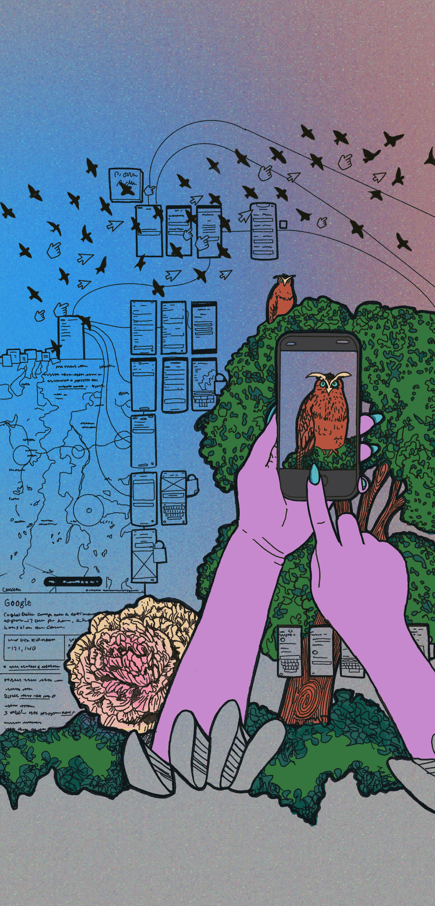
If the UX request is centered around a current process, collaborate on a flow diagram that helps describe the pain point. Begin the exercise by asking the customer to describe how to complete the process in question, step by step, online and offline touchpoints included. Then follow with discussing desired expectations (taking into account time, resources and business priorities). Regardless of how many knowns you begin with, map the conversation visually. Leslie Predy adds that you can better understand a problem through generative research such as interviews or contextual observation as well. Once your team has a shared conceptual model, you can start to talk about information architecture and UI.
Know the Concept, Then the Context
It’s helpful to understand the difference between a technical concept in a general sense; and how the organization or customer puts that concept into practice. For example, to design an enterprise finance app that tracks asset capitalization it would be helpful for the UX team to briefly research what asset capitalization typically looks like in corporate settings; and then follow up with the customer on organization-specific process. Having a general idea helps shape design decisions in a more informed manner; and keeps things from getting too “dumbed-down.”
Keep a Shared Glossary
Start a glossary or Wiki of knowledge transfers with SMEs and product teams to help build a body of info surrounding a product. Once I was on a team that was designing UI meant to help technicians configure control unit logic in vehicles. I do not have an engineering degree, but stayed on target because I could reference well-organized and openly accessible docs. Every time our team met with the customer we added terms and definitions. This lean documentation/team Wiki helped:
- keep the SMEs accountable for giving consistent information;
- give the product team a better understanding of user stories;
- provide a quick way to onboard new people.
Julianna Murphy and Mrinali Kamath put it succinctly: “Create a shared vocabulary by repeating words and terms that your team members use. This way you save time on getting everyone on the same page when it comes to definitions and terminology.”
Check the Units
In terms of content, double check the labels of the x and y axis in data visualizations and make sure the units are correct. Also, avoid pie charts when possible, they have a bad rep among data-visualization specialists. If your content involves unique data blends or scoring systems, be transparent about methods, and possibly include information about methodology somewhere in the product or product documentation.
Designing data-dense products can be challenging; but also really rewarding. UX designers can help see things with fresh eyes, validate assumptions with user feedback, and keep the product vision from getting too insular. In other words, we all have something to contribute — and diverse perspectives make for a better product.